The animation property in CSS is used to apply animations to elements. It allows you to define various animation-related settings, such as the animation name, duration, timing function, delay, iteration count, and more. Animations can be created using the @keyframes rule to define the animation sequence, and the animation property is then used to apply that animation to an element.
@keyframes rule
The @keyframes rule in CSS is used to define animations by specifying a sequence of keyframes that describe different states an element should have during the animation's duration. Each keyframe is associated with a percentage value that represents the progress of the animation. The animation then smoothly transitions between these defined states over time.
Syntax:-
@keyframes animation-name {
from {
/* Initial state */
}
to {
/* Final state */
}
/* Or use percentage values */
0% {
/* State at 0% progress */
}
50% {
/* State at 50% progress */
}
100% {
/* State at 100% progress */
}
}
key components of the @keyframes rule:
• animation-name: :A unique name for the animation that you'll use to reference it in the animation property. • from:Represents the initial state of the element at the start of the animation. • or percentage values (e.g., 0%, 50%, 100%): Represents the final state of the element at the end of the animation, or intermediate states indicated by percentage values.
<!DOCTYPE html>
<html lang="en">
<head>
<meta charset="UTF-8">
<meta name="viewport"content="width=device-width, initial-scale=1.0">
<link rel="stylesheet"href="style.css">
<title>@keyframes rule Example</title>
</head>
<body>
<h1>Welcome to JTC</h1>
<div class="bounce-box">
</div>
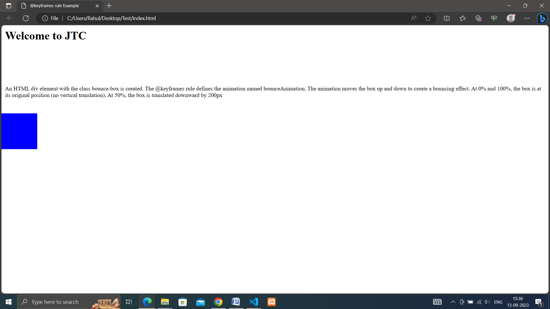
<p>An HTML div element with the class bounce-box is created.
The @keyframes rule defines the animation named bounceAnimation.
The animation moves the box up and down to create a bouncing effect.
At 0% and 100%, the box is at its original position (no vertical translation).
At 50%, the box is translated downward by 200px
</p>
</body>
</html>
animation: name duration timing-function delay iteration-count direction fill-mode play-state;
• name: Specifies the name of the animation defined using the @keyframes rule. • duration: Defines the duration of the animation in seconds (s) or milliseconds (ms). • timing-function: Specifies the timing function that controls the animation's speed curve (e.g., ease, linear, ease-in-out, custom cubic Bezier). • delay: Specifies the delay before the animation starts in seconds (s) or milliseconds (ms). • iteration-count: Defines how many times the animation should repeat (e.g., 1, infinite). • direction: Specifies whether the animation should play forwards, backwards, alternate, or alternate-reverse. • fill-mode: Specifies how the element should be styled before and after the animation (e.g., forwards, backwards, both, none). • play-state: Defines whether the animation is playing or paused (e.g., running, paused).
<!DOCTYPE html>
<html lang="en">
<head>
<meta charset="UTF-8">
<meta name="viewport" content="width=device-width, initial-scale=1.0">
<link rel="stylesheet" href="style.css">
<title>Animation Example</title>
</head>
<body>
<h1>Welcome to JTC</h1>
<div class="moving-circle">
</div>
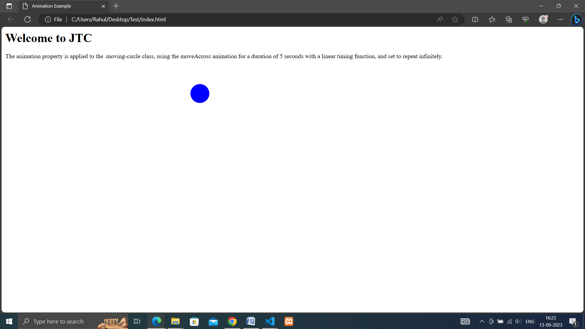
<p>The animation property is applied to the .moving-circle class, using the moveAcross animation for a duration of 5 seconds with a linear timing function, and set to repeat infinitely.
</body>
</html>