*{
margin: 0;
padding: 0;
box-sizing: border-box;
}
h1 , p{
padding: 10px;
}
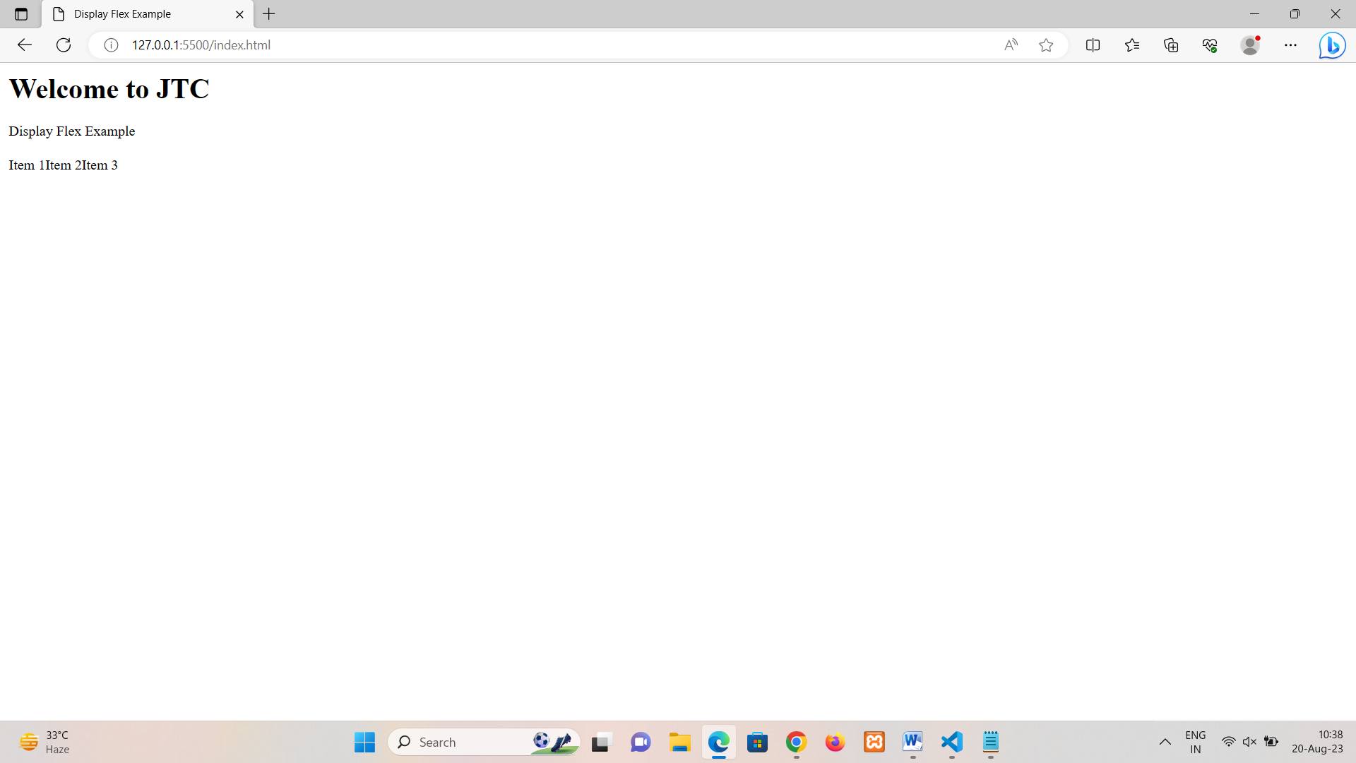
.flex-container {
display: flex;
padding: 10px;
/* Other properties can be added here */
}
flex-direction
The flex-direction property in Flexbox specifies the direction in which flex items are arranged within a flex container. It controls the main axis and cross axis layout of the flex items.
There are four possible values for the flex-direction property:
1. row: This is the default value. It arranges flex items horizontally from left to right along the main axis. 2. row-reverse: It arranges flex items horizontally from right to left along the main axis. 3. column: It arranges flex items vertically from top to bottom along the main axis. 4. column-reverse : It arranges flex items vertically from bottom to top along the main axis.
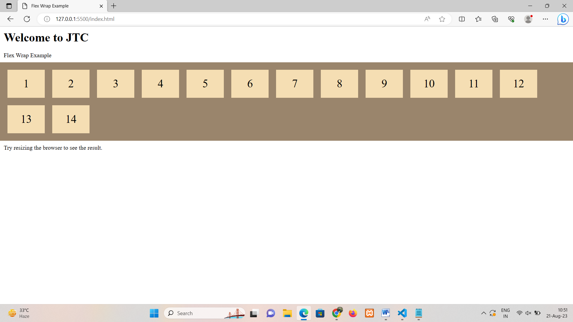
The flex-wrap property in Flexbox controls whether flex items are allowed to wrap onto multiple lines if they can't fit within the flex container along the main axis. It determines how flex items are distributed when they exceed the available space.
There are three possible values for the flex-wrap property:
1. row: This is the default value. Flex items are not allowed to wrap onto multiple lines. They will be compressed to fit within the container's width. 2. row-reverse: Flex items are allowed to wrap onto multiple lines when they can't fit in the container's width.
Flex items wrap onto multiple lines in reverse order. The last item will be on the first line, the second-to-last item will be on the second line, and so on.
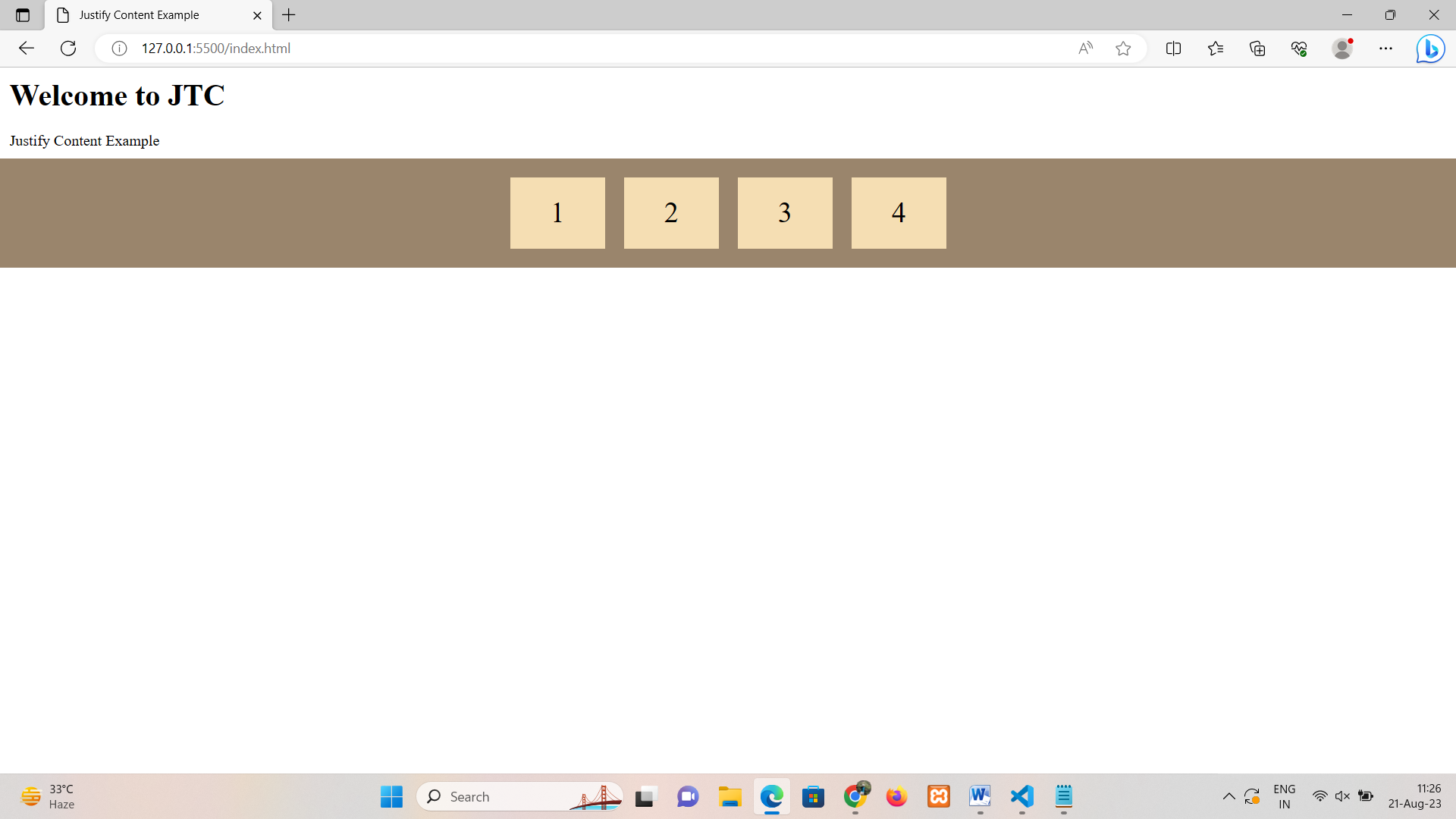
The justify-content property in Flexbox controls how flex items are aligned along the main axis within a flex container. It defines the distribution of space between and around the flex items when there's extra space available along the main axis.
There are five possible values for the justify-content property:
1. flex-start: This is the default value. Flex items are aligned towards the start of the main axis. 2. flex-end: Flex items are aligned towards the end of the main axis. 3. center: Flex items are centered along the main axis. 4. space-between: Space is distributed evenly between the flex items along the main axis. The first and last items touch the edges of the container. 5. space-around: Space is distributed evenly around the flex items along the main axis.
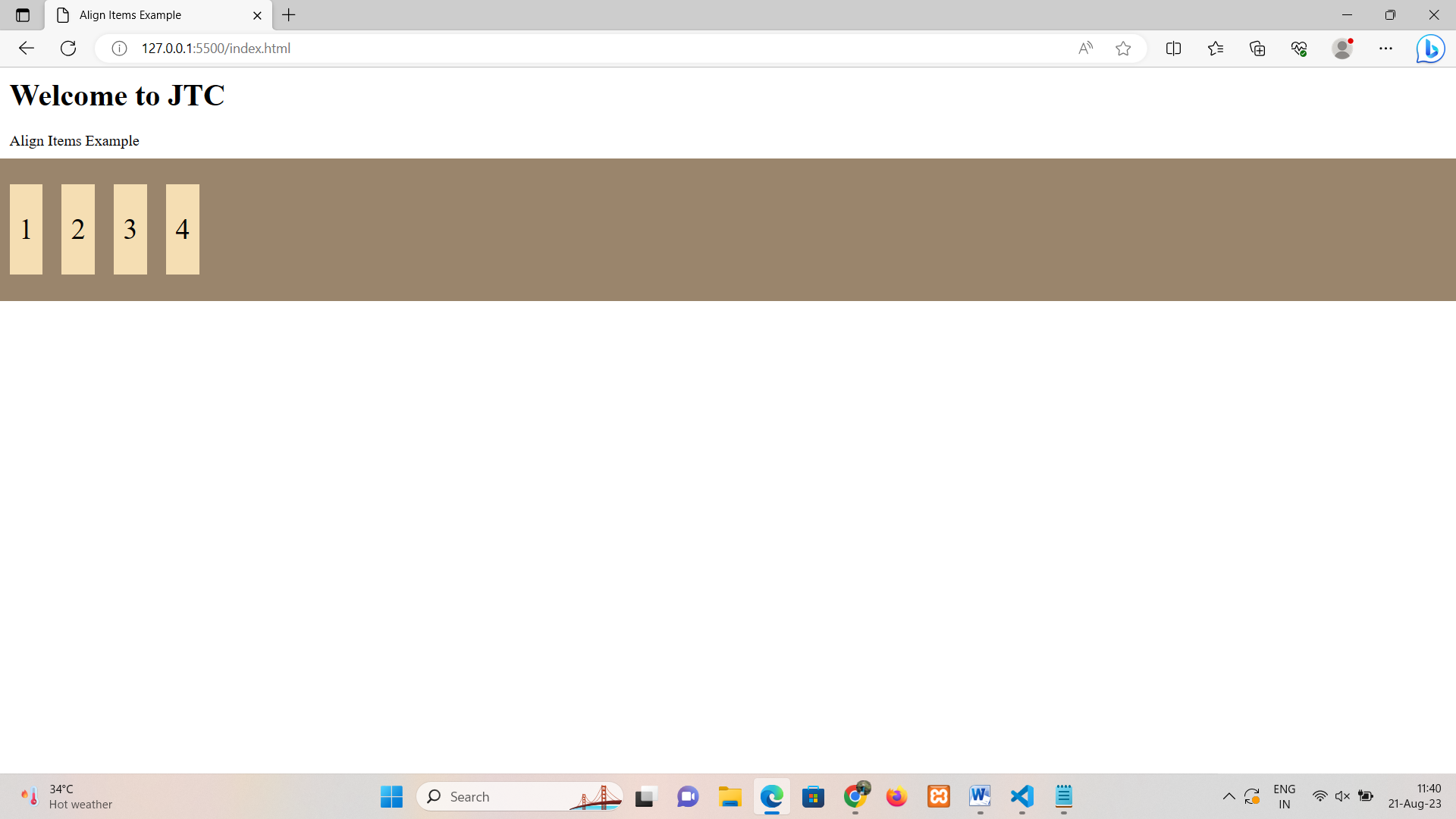
The align-items property in Flexbox controls how flex items are aligned along the cross axis within a flex container. It defines the alignment of flex items when there's extra space available along the cross axis.
There are five possible values for the align-items property:
1. flex-start: This is the default value. Flex items are aligned towards the start of the cross axis. 2. flex-end: Flex items are aligned towards the end of the cross axis. 3. center: Flex items are centered along the cross axis. 4. baseline: Flex items are aligned such that their baselines align. 5. stretch: Flex items are stretched to fill the container's cross-axis.
The align-content property in Flexbox controls how multiple lines of flex items are aligned along the cross axis within a flex container. It defines the distribution of space between and around the lines of flex items when there's extra space available along the cross axis. This property only has an effect when there are multiple lines of flex items.
There are six possible values for the align-content property:
1. flex-start: This is the default value. Lines of flex items are aligned towards the start of the cross axis. 2. flex-end: Lines of flex items are aligned towards the end of the cross axis. 3. center: Lines of flex items are centered along the cross axis. 4. space-between: Space is distributed evenly between the lines of flex items along the cross axis. The first and last lines touch the edges of the container. 5. space-around: Space is distributed evenly around the lines of flex items along the cross axis. 6. stretch Lines of flex items are stretched to fill the container's cross-axis.