CSS transform is a property that allows you to apply various transformations to HTML elements, such as rotating, scaling, skewing, and translating (moving) them on the screen. Transformations alter the appearance and position of elements without changing their original layout in the document.
Here's an overview of the transformation functions that can be used with the transform property:
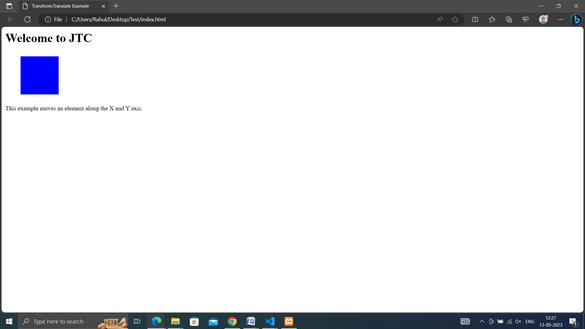
• translate(x, y): Moves an element along the X and Y axes. Positive values move right and down, while negative values move left and up.
<!DOCTYPE html>
<html lang="en">
<head>
  <meta charset="UTF-8">
  <meta name="viewport" content="width=device-width, initial-scale=1.0">
  <link rel="stylesheet" href="style.css">
  <title>Transform:Translate Example</title>
</head>
<body>
    <h1>Welcome to JTC</h1>
    <div class="translate-box"></div><br><br>
    <p>This example moves an element along the X and Y axis.</p>
</body>
</html>
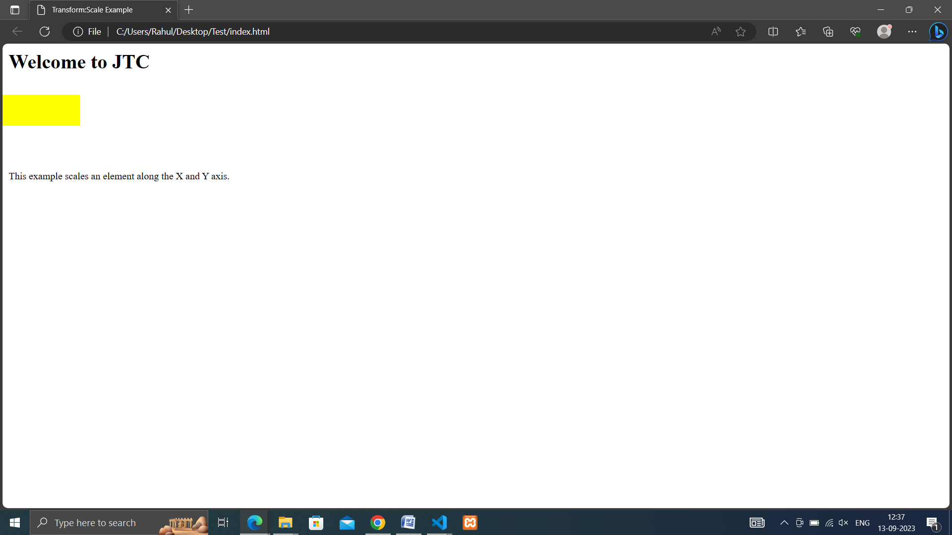
• scale(x, y): Scales an element along the X and Y axes. A value of 1 is the original size, while values less than 1 make the element smaller, and values greater than 1 make it larger.
<!DOCTYPE html>
<html lang="en">
<head>
  <meta charset="UTF-8">
  <meta name="viewport" content="width=device-width, initial-scale=1.0">
  <link rel="stylesheet" href="style.css">
  <title>Transform:Scale Example</title>
</head>
<body>
    <h1>Welcome to JTC</h1>
    <div class="scale-box"></div><br><br>
    <p>This example scales an element along the X and Y axis.</p>
</body>
</html>
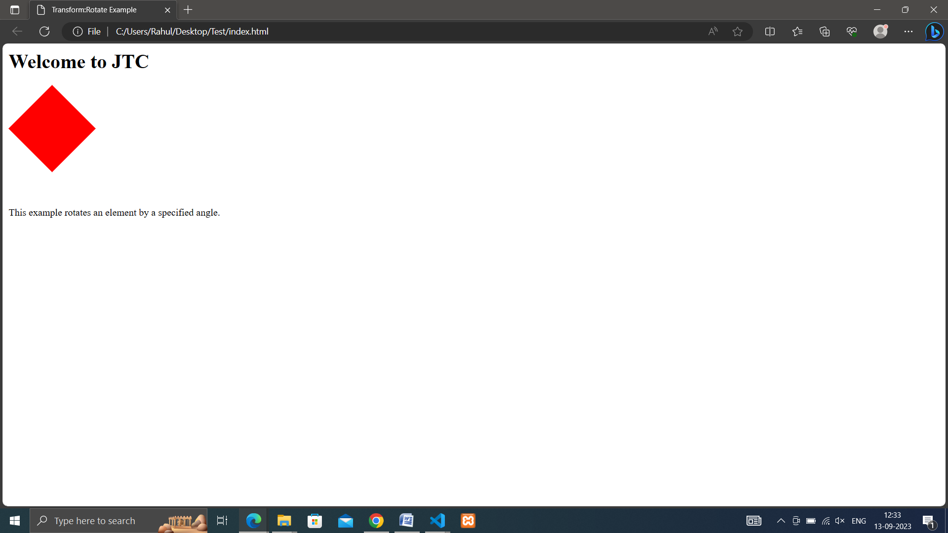
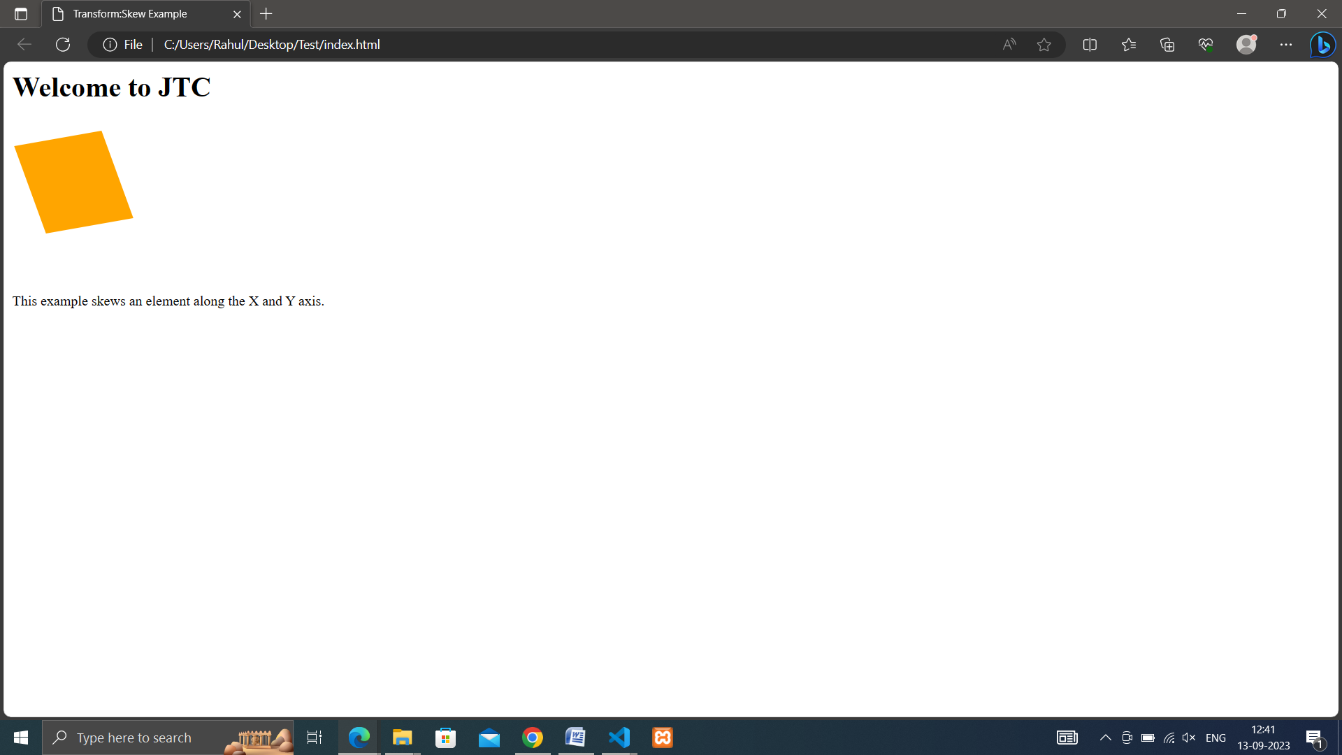
• skew(x-angle, y-angle): Skews an element along the X and Y axes by specified angles.
<!DOCTYPE html>
<html lang="en">
<head>
  <meta charset="UTF-8">
  <meta name="viewport" content="width=device-width, initial-scale=1.0">
  <link rel="stylesheet" href="style.css">
  <title>Transform:Skew Example</title>
</head>
<body>
    <h1>Welcome to JTC</h1>
    <div class="skew-box"></div><br><br>
    <p>This example skews an element along the X and Y axis.</p>
</body>
</html>
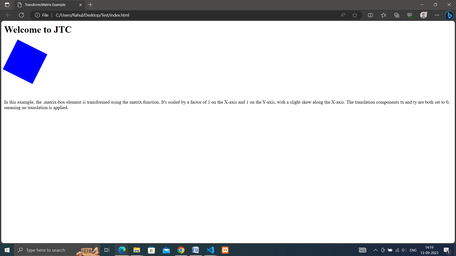
• matrix(a, b, c, d, tx, ty): Allows you to apply a 2D transformation using a six-value matrix. The matrix represents a combination of translation, rotation, scaling, and skewing transformations in a single function. While it offers powerful capabilities, using the matrix function directly can be complex, so it's often more convenient to use individual transformation functions like translate, rotate, scale, and skew.
<!DOCTYPE html>
<html lang="en">
<head>
  <meta charset="UTF-8">
  <meta name="viewport" content="width=device-width, initial-scale=1.0">
  <link rel="stylesheet" href="style.css">
  <title>Transform:Matrix Example</title>
</head>
<body>
    <h1>Welcome to JTC</h1>
    <div class="matrix-box"></div><br><br>
    <p>In this example, the .matrix-box element is transformed using the matrix function. It's scaled by a factor of 1 on the X-axis and 1 on the Y-axis, with a slight skew along the X-axis. The translation components tx and ty are both set to 0, meaning no translation is applied.</p>
</body>
</html>