CSS transitions allow you to smoothly animate changes in CSS properties over a specified duration. With transitions, you can control how elements change from one style to another when certain conditions are met, such as when hovering over an element or applying a class. Transitions are applied using the transition property.
• property: Specifies the CSS property that should be transitioned. You can list multiple properties separated by commas or use the value all to transition all animatable properties. • duration:Defines the duration of the transition in seconds (s) or milliseconds (ms). For example, 0.5s or 200ms. • timing-function: Specifies the timing function that controls the animation's speed curve. It can take values like ease, linear, ease-in, ease-out, ease-in-out, or a custom cubic Bezier function (cubic-bezier(x1, y1, x2, y2)).
■ ease: The default timing function. Starts slow, accelerates, and slows down again. ■ linear: Creates a constant rate of change throughout the transition. ■ ease-in: Starts slow and accelerates. ■ ease-out: Starts fast and decelerates. ■ ease-in-out: Starts slow, accelerates, and then slows down again. ■ cubic-bezier(x1, y1, x2, y2): Allows you to define a custom cubic Bezier curve for precise control over the timing function. The coordinates (x1, y1) represent the acceleration, and (x2, y2) represent the deceleration.
• delay (optional): Sets a delay before the transition starts. It can be specified in seconds (s) or milliseconds (ms). For example, 0.2s or 500ms.
Here's an overview of how CSS transitions work:
1. Transition Property: Specifies which CSS properties should be transitioned and the duration of the transition. 2. Triggering Transitions: Transitions can be triggered by events like hovering, focusing, or adding/removing classes using CSS pseudo-classes and JavaScript.
<!DOCTYPE html>
<html lang="en">
<head>
  <meta charset="UTF-8">
  <meta name="viewport"content="width=device-width, initial-scale=1.0">
  <link rel="stylesheet"href="style.css">
  <title>Transition Example</title>
</head>
<body>
    <h1>Welcome to JTC</h1>
    <div class="box">

    </div>
    <p>Move the cursor over the box</p>
    <p>The transition effect will start after 1s.</p>
</body>
</html>
In this example, the .box element will smoothly transition its width from 100px to 400px on hover. The ease-in-out timing function creates a smooth acceleration and deceleration effect during the transition.
Transition + Transformation
Combining CSS transitions and transformations allows you to create sophisticated and engaging visual effects on web elements. By applying transitions to transformation properties, you can smoothly animate the changes caused by transformations.
<!DOCTYPE html>
<html lang="en">
<head>
<meta charset="UTF-8">
<meta name="viewport" content="width=device-width, initial-scale=1.0">
<link rel="stylesheet" href="style.css">
<title>Transition Example</title>
</head>
<body>
<h1>Welcome to JTC</h1>
<div class="box">
</div>
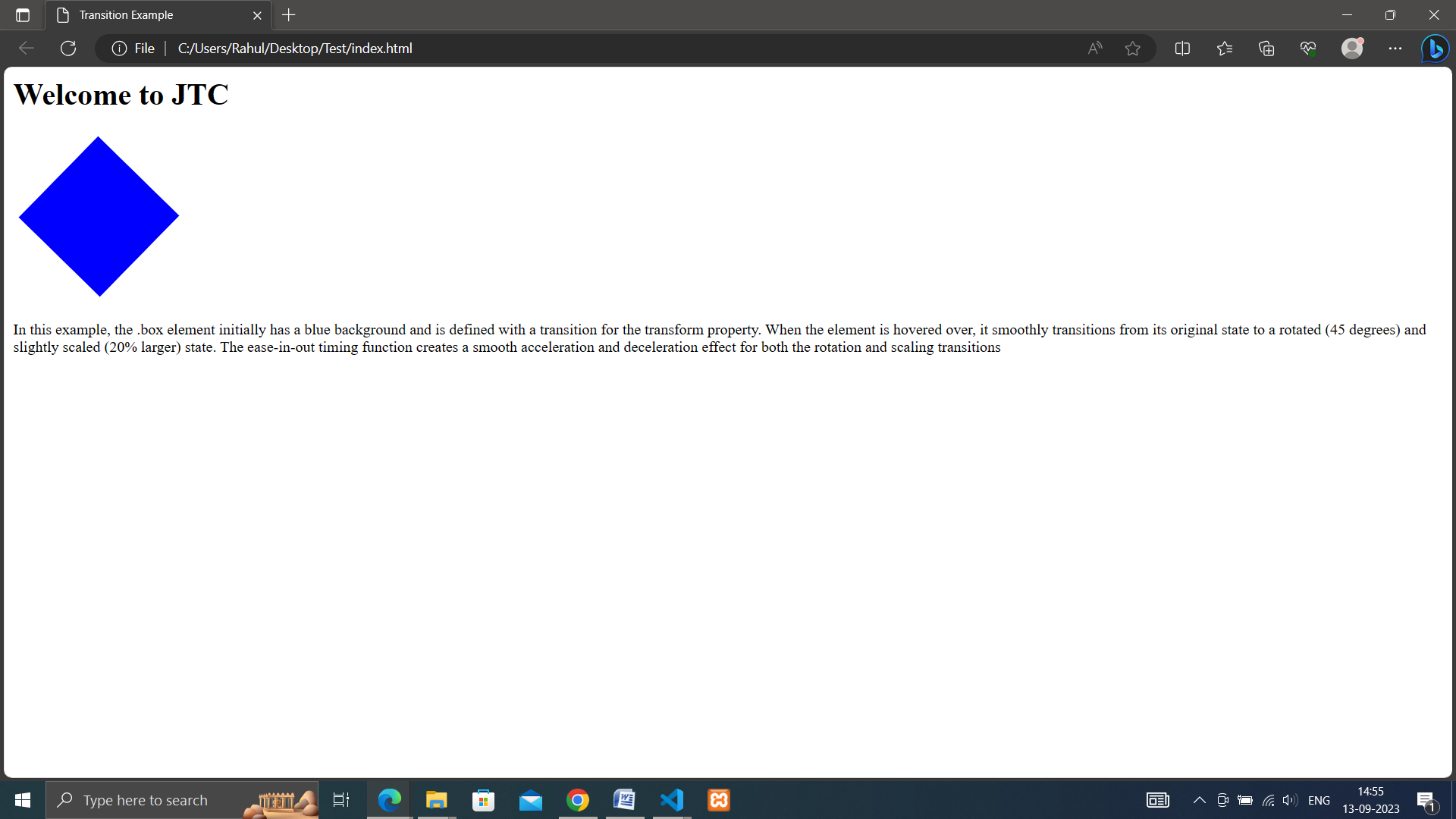
<p>In this example, the .box element initially has a blue background and is defined with a transition for the transform property. When the element is hovered over, it smoothly transitions from its original state to a rotated (45 degrees) and slightly scaled (20% larger) state. The ease-in-out timing function creates a smooth acceleration and deceleration effect for both the rotation and scaling transitions</p>
</body>
</html>