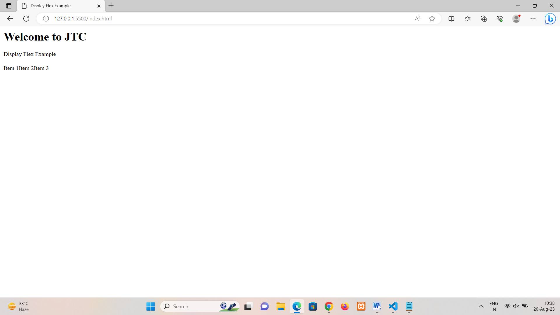
The order property in Flexbox allows you to control the visual order of flex items within a flex container. By default, flex items are displayed in the order they appear in the HTML markup. However, the order property lets you change that order without modifying the HTML structure. It accepts a numeric value as its parameter, and items are displayed in ascending order based on the value assigned to them.
Here's how the order property works;
• The default order value for flex items is 0.
• A lower order value makes an item appear earlier in the visual order.
• A higher order value makes an item appear later in the visual order.
Note:
• The order property is relative to other flex items in the same container.
• Negative order values are allowed, but should be used carefully.
• Flex items with equal order values are displayed in the order they appear in the markup.
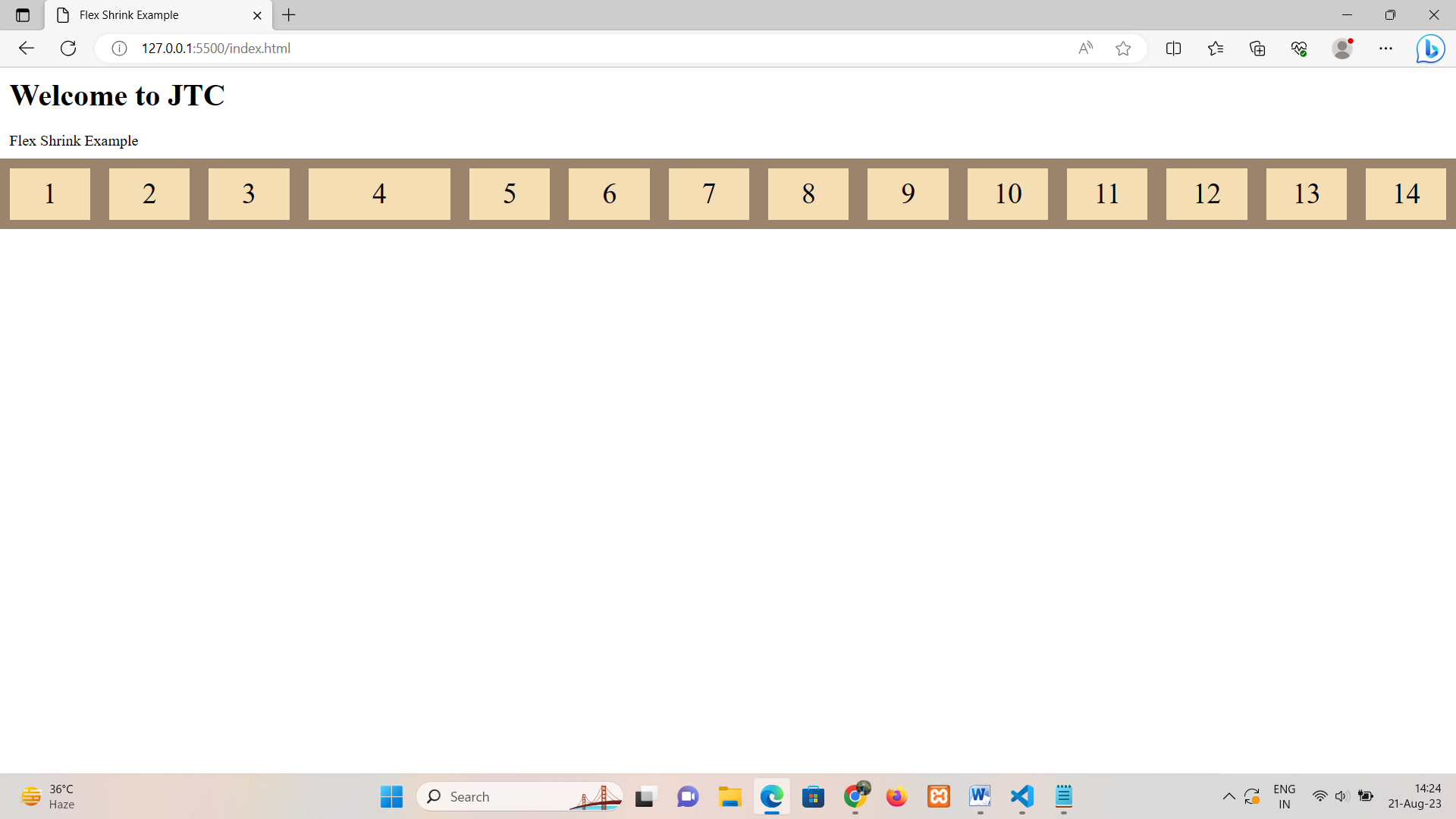
Flex Shrink
The flex-shrink property in Flexbox controls how flex items shrink in relation to each other when there's not enough space along the main axis of the flex container. It specifies the ability of a flex item to shrink if the available space is insufficient to accommodate all the flex items' sizes.
The flex-shrink property accepts a unitless number as its value. The default value is 1, which means all flex items will shrink proportionally. If you set flex-shrink to 0, that particular item won't shrink when the container's size decreases.
Here's how the flex-shrink property works:
• A higher value of flex-shrink makes an item shrink more than other items with lower flex-shrink values.
• If all items have flex-shrink: 0, they won't shrink at all, and the overflow may occur.
In this example, all flex items have the default flex-shrink value of 1, meaning they will shrink equally when the available space is limited and only one flex item with flex-shrink value of 0 will not shrink or expand when the available space is limited or not .If you increase the flex-shrink value for a specific item, that item will shrink more compared to others.
Note:
• The actual amount of shrinkage depends on the flex-shrink value in relation to other items and the available space.
• If you want an item to never shrink, set its flex-shrink value to 0.
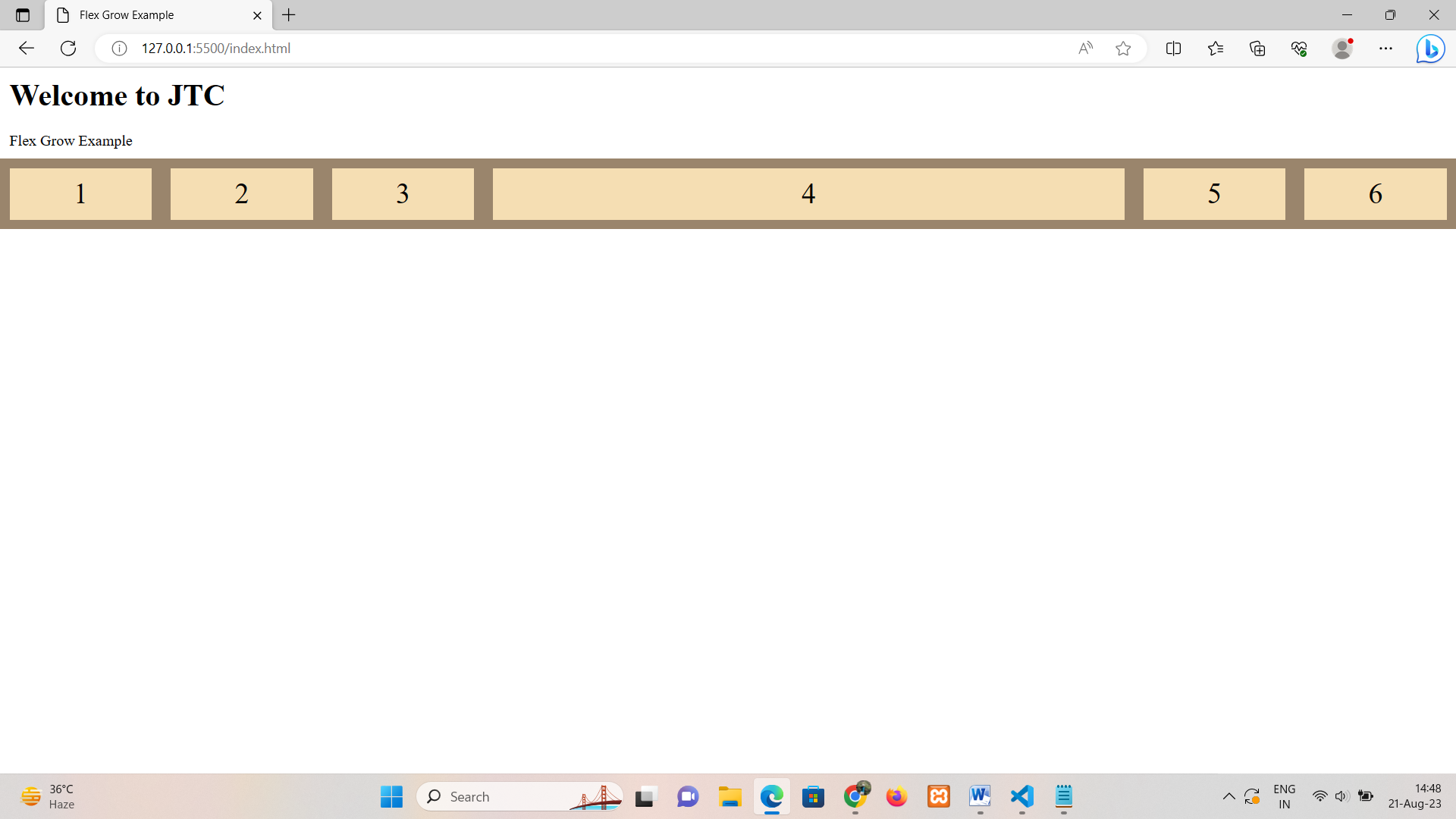
Flex Grow
The flex-grow property in Flexbox controls how flex items grow in relation to each other when there's extra space available along the main axis of the flex container. It determines the distribution of available space among flex items based on their flex-grow values. The flex-grow property accepts a unitless number as its value.
Here's how the flex-grow property works:
• A flex item with a higher flex-grow value grows more compared to items with lower flex-grow values.
• If all flex items have the same flex-grow value, they will grow equally to fill the available space.
In this example, all flex items have the default flex-grow value , so they will grow equally and one flex-item with flex-grow value to 2 that flex-items is bigger than the others to occupy the available space along the main axis.
We use cookies to enhance your user experience. By continuing using our site, you agree to our use of cookies.