CSS Grid Layout is a powerful layout system in CSS that allows you to create complex two-dimensional layouts with rows and columns. It enables you to efficiently structure and position elements on a webpage, making it easier to create responsive and flexible designs. CSS Grid provides a comprehensive approach to layout control, and it's especially useful for creating grid-based designs and handling both rows and columns simultaneously.
Here's an overview of how CSS Grid Layout works and how to use it:
• Defining a Grid Container: To create a grid layout, you need to define a grid container. This is usually an element, such as a <div>, that you want to transform into a grid. You do this by applying the display: grid; property to the container. • Setting Up Grid Columns and Rows: You can define the columns and rows of your grid using properties like grid-template-columns and grid-template-rows. These properties allow you to specify the size of each column and row using various units like pixels, percentages, or fractions. • Placing Items in the Grid: Use properties like grid-column and grid-row to place items within the grid. You can specify the start and end positions of items along the columns and rows. • Creating Grid Gaps: You can define gaps (spacing) between columns and rows using properties like grid-column-gap and grid-row-gap. • Responsive Design with Media Queries: CSS Grid works well with media queries to create responsive layouts. You can adjust the number of columns and the size of rows based on the screen size.
• Grid Lines and Named Grid Areas:You can create more advanced layouts by using grid lines and naming specific areas of the grid. This allows you to have finer control over the placement of items.
CSS Grid Layout is well-supported by modern browsers and provides a flexible and powerful way to create layouts. It's particularly useful for creating grid-based designs, complex layouts, and responsive web pages.
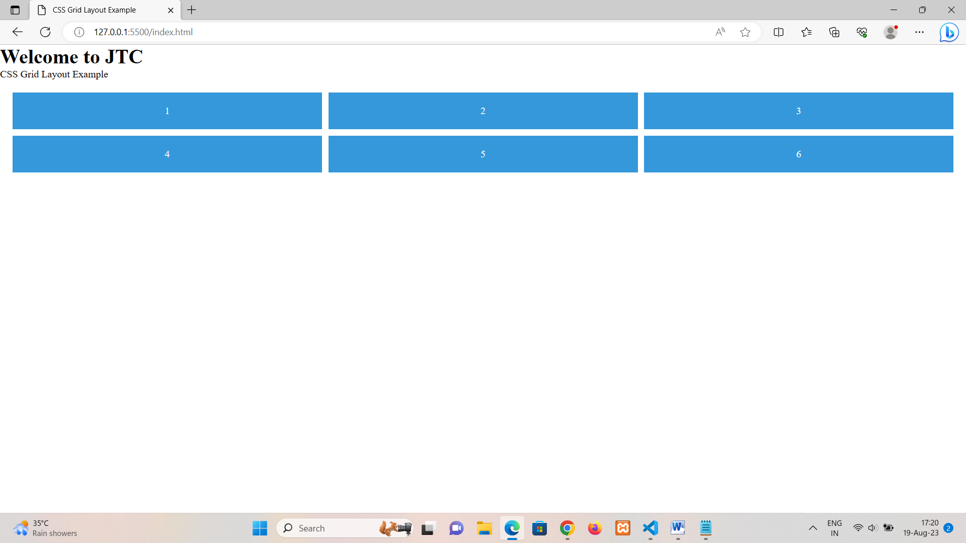
In this example:
• We have a .grid-container that's set to display: grid; to define it as a grid container.
• We're using grid-template-columns to define three equal columns using the repeat function and 1fr (fractional unit). This means each column takes up an equal portion of the available space.
• grid-gap adds a 10px gap between the grid items.
• .item elements represent the individual grid items. They have a blue background, white text, centered content, and padding.
This will create a 3x2 grid where each .item takes up one cell. The grid automatically adjusts its layout based on the specified column setup.
Keep in mind that this is a basic example. CSS Grid Layout allows for more complex layouts involving named grid areas, spanning items across multiple columns/rows, responsive designs with media queries, and more. It's a versatile tool for creating a wide range of layouts.
We use cookies to enhance your user experience. By continuing using our site, you agree to our use of cookies.